
Our initial analysis of public school tax credits showed an increase in overall contributions during the nine years analyzed. Find our first blog here and our second blog here. The next question the Association sought to answer was which public schools have benefited from tax credits and to what extent.
In order to determine which public schools benefit from public school tax credit contributions, we looked at the variability in per pupil contributions across all schools. Figure 1 shows the relative size differences in per pupil tax credit contributions for schools in 2013, the most recent year these data were available.
FIGURE 1: Variation in Per Pupil Tax Credit Contributions to Schools, 2013
It is clear from this simple visual that the amount of tax credit contributions schools receive varies significantly. Some schools may receive little or no funding per pupil, while other schools receive hundreds of dollar per pupil in tax credit contributions.
What might account for these differences?
Public school tax credits are voluntary contributions made to schools by individual taxpayers. Schools rely largely on parents to make tax credit contributions, particularly if these are collected as fees for extra-curricular activities rather than general contributions to the school. They also rely on their communities and often promote on their websites, district newsletters or advertise in local media to get the word out about tax credit contributions. It is not unusual to see a solicitation on a community bulletin board or a movie theater screen prior to the feature. The success of these efforts will likely be dependent on the income level of parents and the local community.
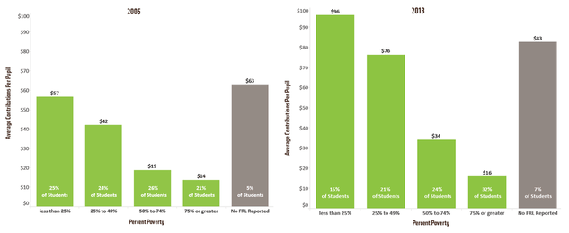
In order to determine whether there is a relationship between a school’s level of poverty and the amount of contributions that a school receives, we linked the public school tax credit data to school-level percentage of students eligible for free or reduced-priced lunch (FRL) as part of the National School Lunch Program.
Although it is not without some limitations, percent FRL is the best available proxy for the level of poverty in an Arizona school. For this analysis, we divided schools into five categories:
- Fewer than 25% FRL
- 25%-49% FRL
- 50%-74% FRL
- 75% or more FRL
- No FRL data
FRL Data
Summary
DATA AND METHODOLOGY
The primary data for this blog series consists of school-level tax credit amounts reported by schools for years 2005 through 2013. These files were obtained from the Arizona Department of Revenue [1] and include the total number of donations a school received, the total dollar amount received, and the total amount spent for each year. Additionally, for years 2011-2013, these files contain information about tax credit expenditures by category. To enhance our understanding of school-level characteristics, we linked the tax credit data to enrollment [2] and poverty data [3] obtained from the Arizona Department of Education.
The Department of Revenue collects data from each public school in the state and in most cases the data are reported for each school. In some cases, the data are reported as aggregated district amounts. For our analyses, we utilized all data reported, whether by district or by school, for all state summary tables and graphs. Where our analysis required school-level information, the district-level cases were omitted.
While the tax credit may be taken for either a general contribution or for fees, the Department of Revenue data does not draw a distinction. As a result, there is no way to know whether the amounts schools receive are donations that can be used at the discretion of the school, or whether they are in the form of fees that are, in practical terms, earmarked for a particular student.
For our expenditure analysis, we took each expenditure category listed in the tax credit file and summed them across schools to determine a statewide total expenditure by category. Because several categories listed in the tax credit file overlap (i.e. “sports” and “athletics”), we chose to combine them. These categories are athletic and sports programs, fine and performing arts, extended day and summer programs, cheerleading and rifle team, and driver’s education programs.
Footnotes/References
[1] Public School Tax Credit Reports, available at http://www.azdor.gov/ReportsResearch/SchoolTaxCredit.aspx
[2] Average Daily Membership Reports available at http://www.azed.gov/finance/reports/#SafrTop
[3] Percent of students who qualify for the National School Lunch Program, available http://www.azed.gov/health-nutrition/frpercentages/